
The booking form we almost shipped
Our first draft of the Loop Cycle Co-op booking form had seven fields. The one that shipped has three. Here is what we cut and why.
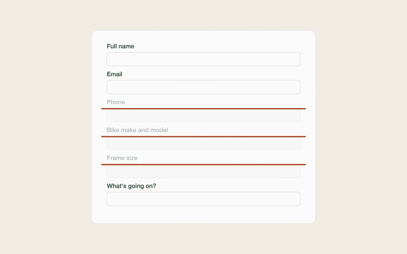
Loop is a volunteer bike workshop. People book a repair stand for ninety minutes and a mechanic helps them fix their own bike. Our job was to make booking easy. Our first draft made it thorough instead.
Version one
The first form asked for name, email, phone, bike make and model, frame size, what is wrong, and how they heard about Loop. Every field had a reason. The volunteers wanted to prepare. The board wanted to know where people came from. It looked reasonable in a design review.
Then we watched five people try it on their phones.
What happened
Nobody knew their frame size. Two people abandoned the form at "bike make and model" to go outside and look. One person typed "blue" in it. The phone field made someone ask, fairly, whether they were going to get sales calls.
The volunteers, meanwhile, told us they never looked at frame size anyway. They look at the bike.
What we cut
- Phone. Email is enough to confirm and remind.
- Bike make and model. Replaced by "What kind of bike?" with a few plain choices.
- Frame size. Nobody knows it, and nobody used it.
- How did you hear about us. Moved to an optional question on the confirmation screen.
What is left is a time, a short description in your own words, and a name. "Rear brake rubs, gears skip" tells a mechanic more than a model number ever did.
The rule we took away
Every field needs a person who will read it, and a reason they cannot get the answer another way. If either is missing, the field goes. It is the most useful rule we know, and we still have to relearn it on nearly every project.