
Twelve coffees, one system
How we designed packaging for a roaster whose coffees change every season, without redesigning the bag every season.
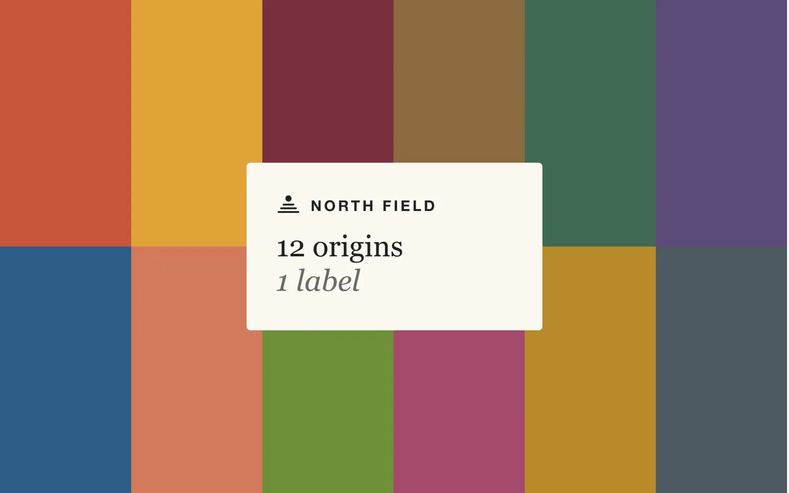
North Field sells twelve coffees at a time, and most of them are gone within a season. When we met them, every coffee had its own label by a different freelancer. Individually they were lovely. Together on a shelf they looked like a market stall.
The fix was not a better label. It was deciding what should never change.
Split the bag in two
We divided every bag into two jobs. The top half is the brand: the mark, the name, the layout. That part is printed in bulk on stock bags and never changes. The bottom half is the coffee: one coloured band with the origin, process and roast.
It sounds obvious written down. In practice it meant saying no to lots of nice ideas, like a custom illustration per origin, that would have tied the brand to things that disappear every few months.
Let the coffee pick the colour
Each band colour comes from the tasting notes. Huila tastes of red plum and panela, so it is a clay red. Yirgacheffe is jasmine and lemon, so it is warm yellow. The rule gives the team a starting point and a reason, which matters more than the exact hex value.
Hand over the template, not the files
The roasters print bands in-house on the day a coffee launches. We gave them a template with three fields and one colour picker, plus a one-page guide. Nobody needs design software, and nobody needs to call us.
The shop follows the shelf
The website uses the same split. Every product page picks up its band colour, so a coffee looks the same in a café, in a subscription box and on a phone.
Good systems are mostly about what you refuse to vary. Twelve coffees, one bag, one band. That is the whole brand.