Branding · Packaging · Typography
Ember & Oat
Identity, packaging and a pre-order site for a neighbourhood bakery that sells out before nine.
The brief
Ember & Oat bakes from four in the morning and is usually sold out by nine. Regulars loved it. Everyone else found a queue, then an empty shelf, then a handwritten sign. Owners June and Theo wanted a way for people to reserve bread without turning a neighbourhood bakery into an app.
What we did
We started with the menu board, because that is where every customer looks first. Setting it well told us most of what the brand needed: a warm serif, a sunrise mark, and the discipline of saying only what is in the oven today.
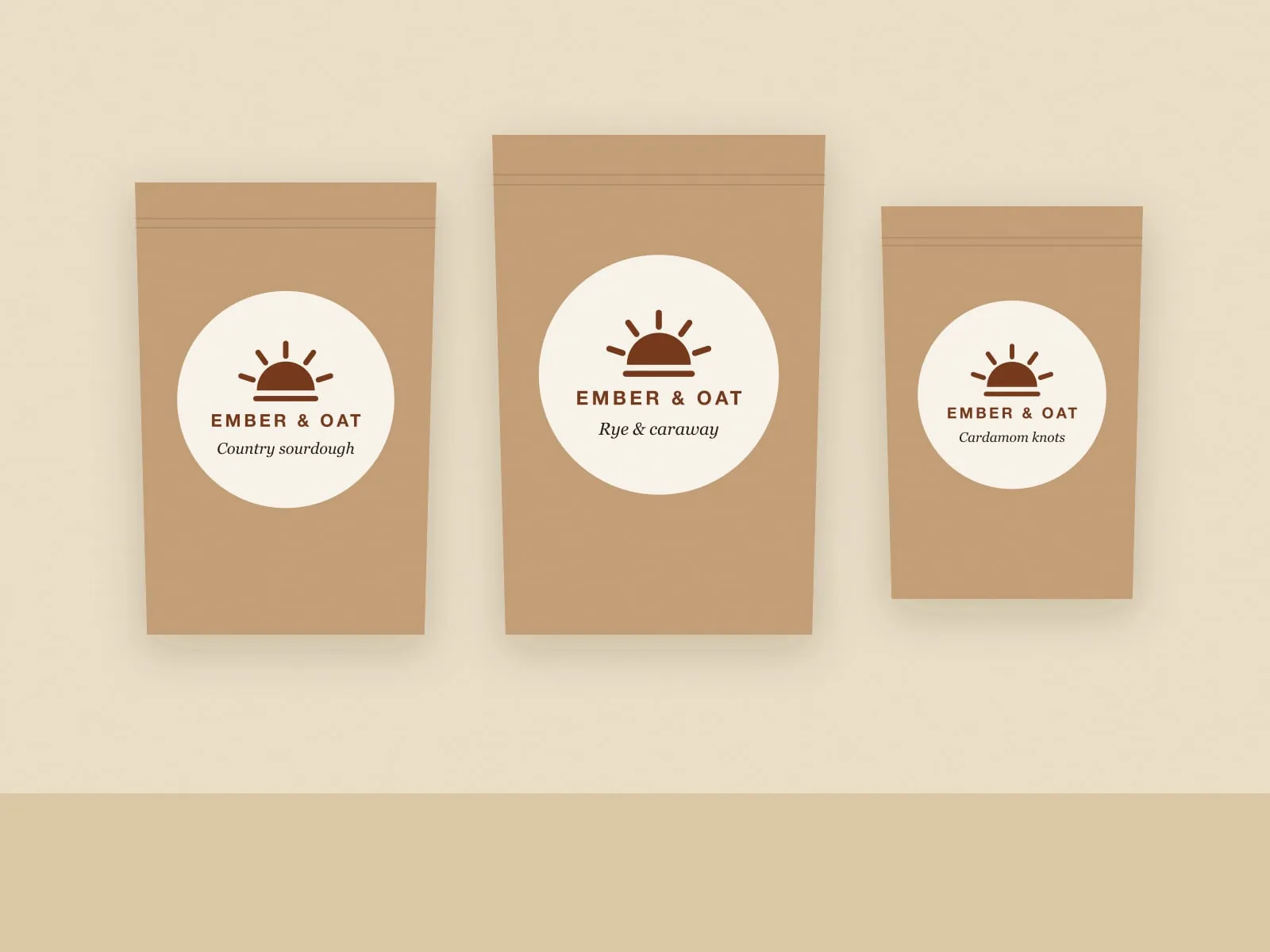
- Packaging you can stamp. A single round label, printed in one colour, with the bake written in by hand. It works for every loaf and costs almost nothing.
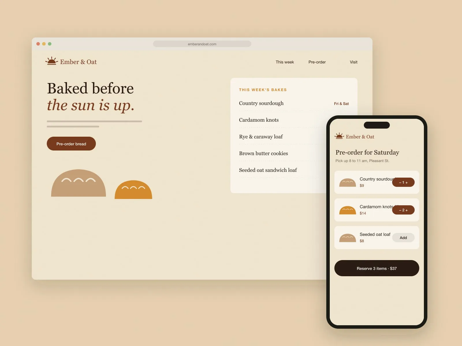
- Pre-order in three taps. Pick Friday or Saturday, choose your bakes, reserve. No accounts and no payment up front. You pay at the counter like everyone else.
- A weekly menu the bakers write. The site's "This week" list is edited on Wednesday night and becomes the menu board on Friday morning.
Outcome
The queue is still there, which June says is the point. The difference is that the people at the end of it now know what will be left, and the bakers know how much dough to mix on Thursday.