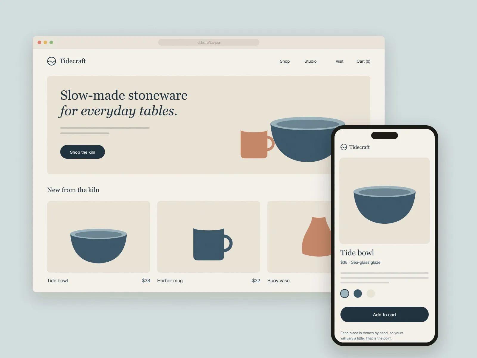
A new identity and online shop for a two-kiln pottery on the coast, built so the potter can list a new glaze herself in minutes.
Brand identity · Online shop · Product photography direction

Names, marks, colour and the small rules that keep a brand recognisable.
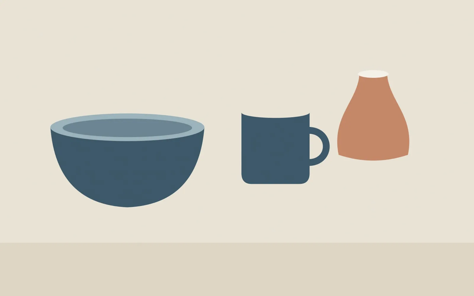
A new identity and online shop for a two-kiln pottery on the coast, built so the potter can list a new glaze herself in minutes.
Brand identity · Online shop · Product photography direction
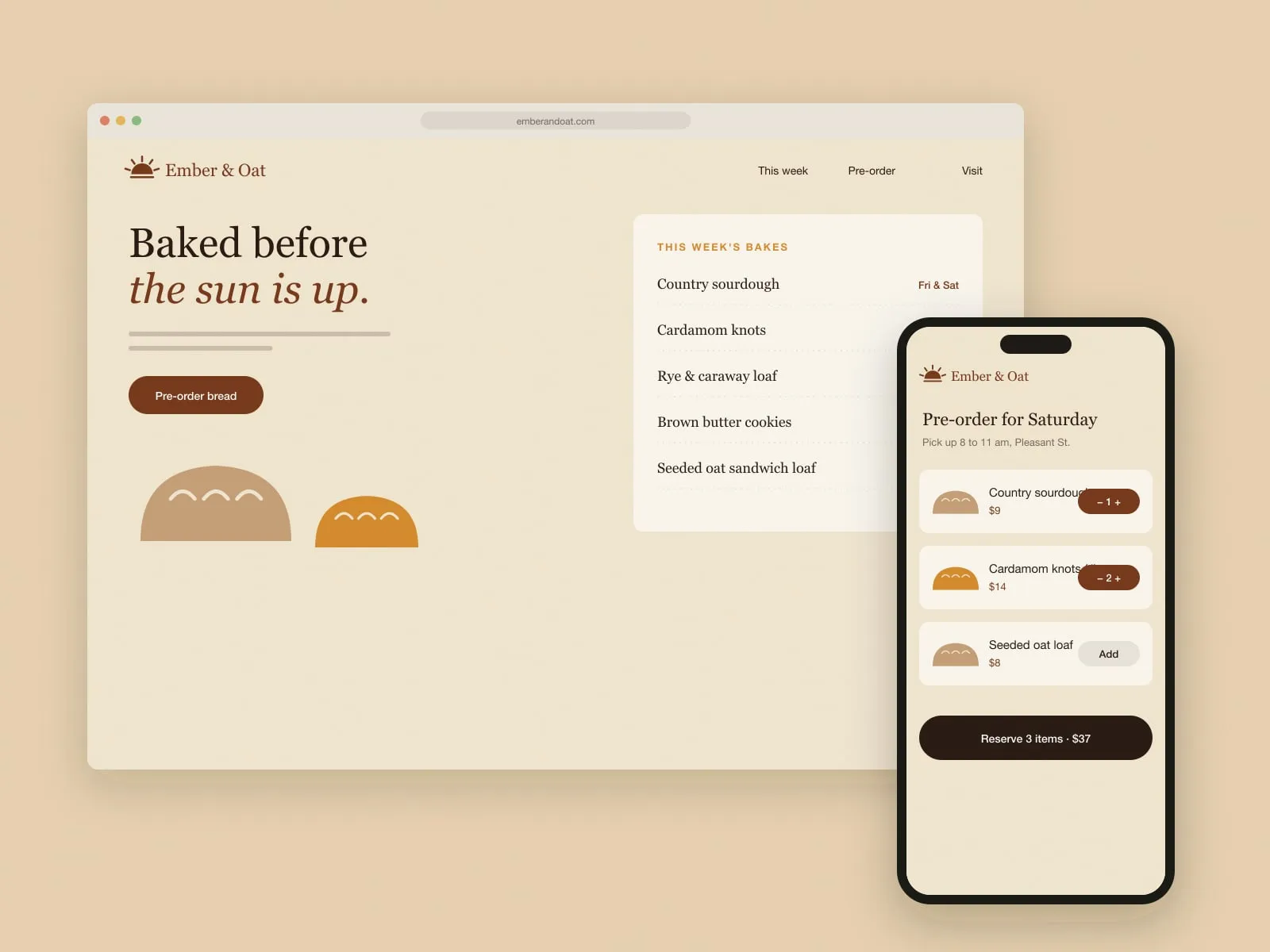
Identity, packaging and a pre-order site for a neighbourhood bakery that sells out before nine.
Brand identity · Packaging · Menu and signage
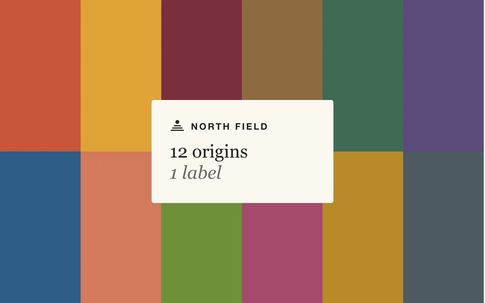
A packaging system for a small roaster with twelve changing coffees, and a website that reads like the bag.
Packaging system · Label templates · Website and subscriptions
What we learned building the Tidecraft shop, and why we spent a full firing day in a pottery before opening a design file.
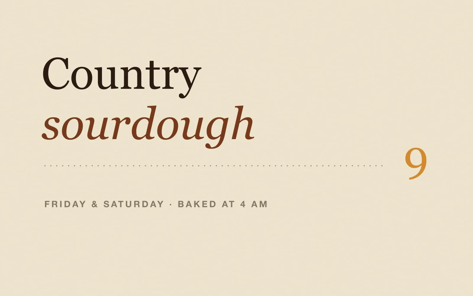
Setting the Ember & Oat menu board by hand taught us more about the brand than any moodboard. Here is what we kept.
How we designed packaging for a roaster whose coffees change every season, without redesigning the bag every season.