
What a bakery taught us about menus
Setting the Ember & Oat menu board by hand taught us more about the brand than any moodboard. Here is what we kept.
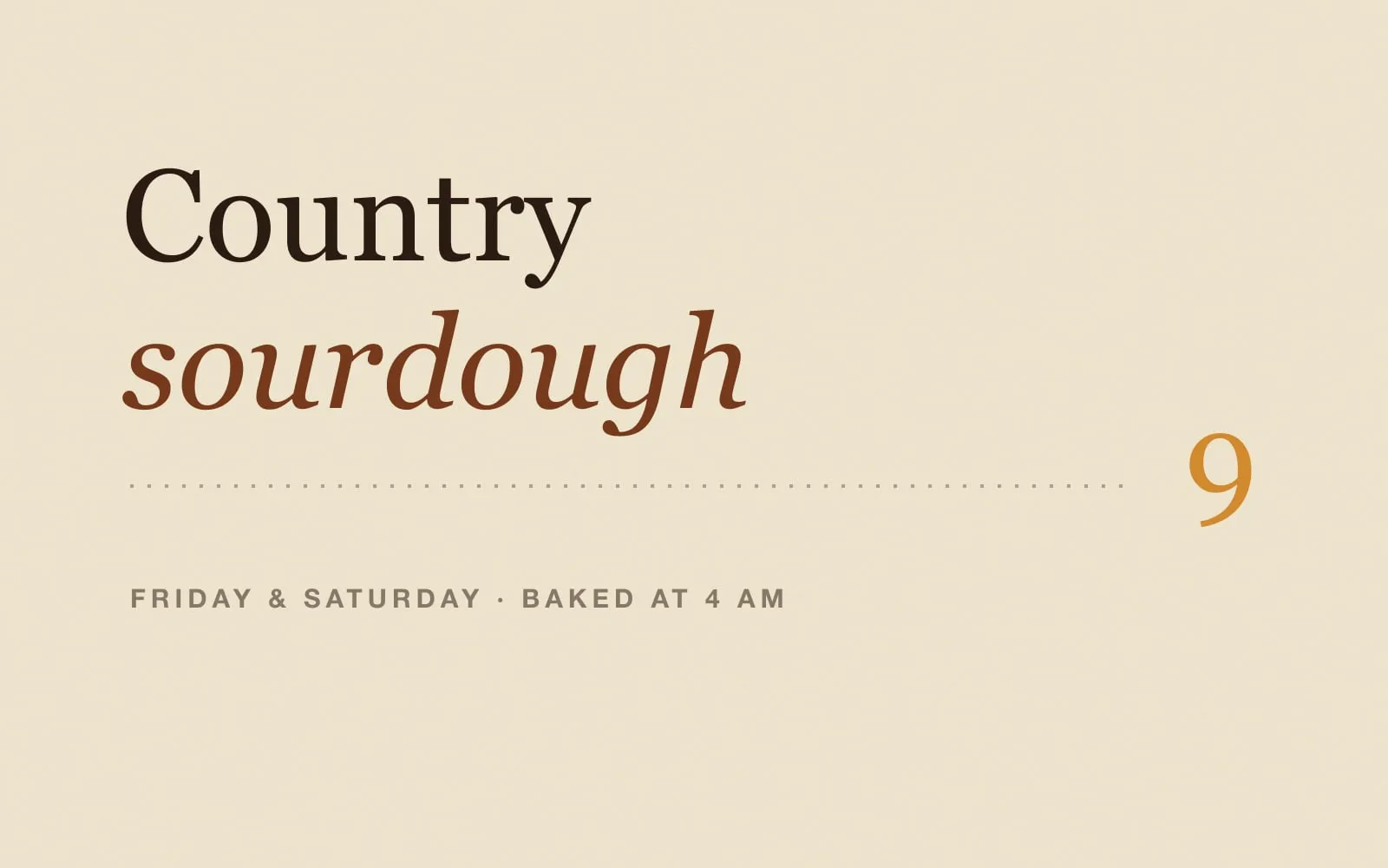
We start a lot of projects in odd places. For Ember & Oat, it was the chalkboard behind the counter.
A menu board is a brutal brief. People read it from three metres away, half-awake, while someone behind them is asking if they are in the queue. It has to work in about four seconds. If the type holds up there, it will hold up anywhere.
One typeface, two voices
We set the whole board in a single warm serif. Upright for what the thing is, italic for how it feels. "Country sourdough". It gave the brand a voice before it had a logo, and the same pairing now runs through the bags, the website and the Instagram posts.
Leaders are underrated
Dotted leaders, the little dots that run from the name to the price, fell out of fashion years ago. We brought them back because they solve a real problem: on a wide board, your eye loses the line between "Cardamom knots" and its price. The dots carry it across. On the website they do the same job on the weekly bakes list.
Say only what is in the oven
The hardest rule was editorial, not typographic. The old board listed everything the bakery had ever made, with "sold out" stickers on half of it. The new one lists only what is baking this week, in the order it comes out of the oven.
That rule became the whole website. The "This week" list is edited on Wednesday night by the bakers themselves. No archive, no specials that ended in March, no apology stickers.
What we kept for the rest of the brand
- A type pairing strong enough to carry the brand without a logo
- Leaders, because readability beats fashion
- An honest, short list, updated by the people who bake it
Menus are small, but they are the most-read thing a bakery makes. Start there and the rest gets easier.